
NRD Devlog #001 — What a game with no HUD actually costs
No Return Depth has no HUD, which sounds like a decision you make once and then stop paying for. It is not. Every answer a HUD would have given has to become a physical object in a compartment — and six of our signs could not be read while passing the entire test suite.
No Return Depth has one rule that shapes almost everything else: there is no HUD. No objective tracker, no minimap, no waypoint, no compass, no status stack, no interaction prompt hovering in the middle of the screen.
It sounds like a decision you make once, in a design document, and then stop paying for. It is not. It is a bill that arrives every time the game needs to tell a player something.
Every answer becomes an object
A HUD is a place to put answers. Take it away and the answers do not disappear — they have to go somewhere else, and the only “somewhere else” that does not break the fiction is a physical object inside the boat.
So the answers became furniture. There is an instruction plate above each of the five crew stations, with a tasking lamp on it. The orders board on the bridge doubles as the Crew Operations Handbook, and carries a numbered procedure for the current expedition — a sector, a phase count, and a named watch for each step. Above the helm there is a card screwed to the bulkhead that reads, in order: take the wheel, steer to the ordered course, hold and report course. Then a fourth line reminding you that ordered speed belongs to propulsion, not to the wheel, because that is the mistake every new helm officer makes.
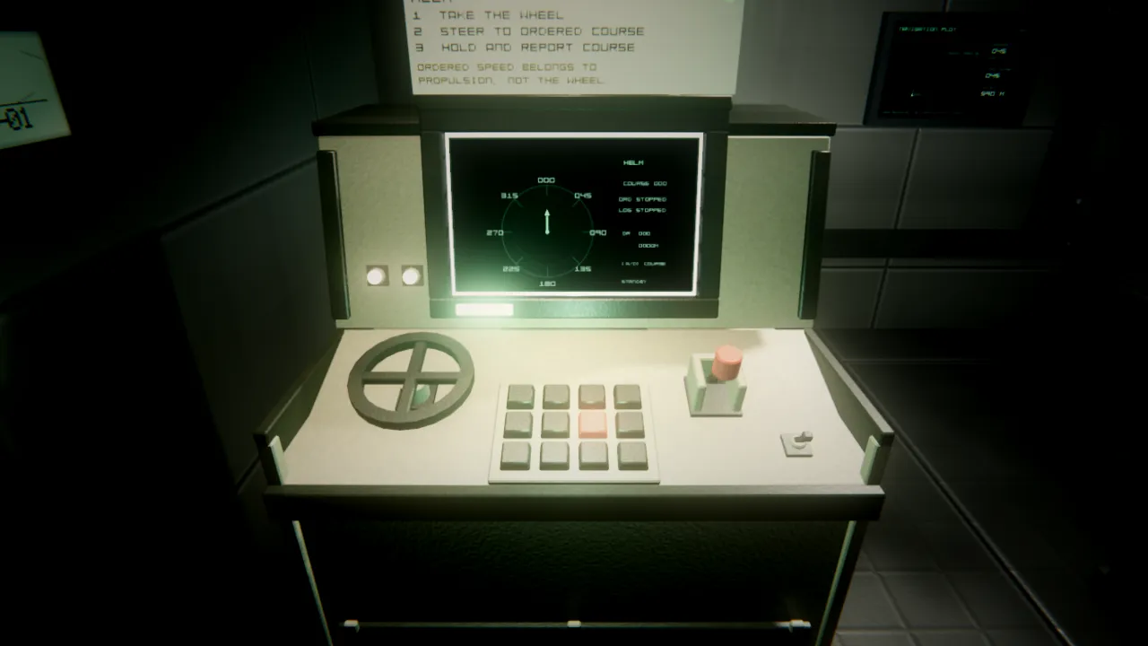
The tutorial, such as it is.
A player who has never played can walk to the bridge and read what the expedition is, which sector it is in, which of five phases the crew are on, and who is meant to be doing what. All of it from inside the fiction. None of it on a layer floating above the world.
That is the good version. Here is the bill.
Six signs that could not be read, and passed every test
When we audited the boat’s signage, six signs were unreadable. Four were painted partly onto nothing — a doorway, a void, the inside of another compartment’s bulkhead. One was printed onto the navigation plot’s bezel. And the plot itself stood directly behind the survey map’s glass, so the chart read as a second screen behind the first.
Every one of those six passed the entire automated test suite.
This is the part that is easy to miss when you take the HUD away. A HUD element is code, and code has a test surface: is the value right, does it update, does it clear. A sign is a thing in a room, and the questions are different. Is it lit. Is it whole. Is anything in front of it. Can you read it from where a person would actually be standing.
We now have automated checks for exactly those questions, and four of them were written by taking each of the six defects and making a test fail on it.
The light switch that only announced itself in lit rooms
The best example we have of this whole problem is a light switch.
Two things were reported from play: the switches are not obvious, and in the dark they are effectively invisible. Both were true, and they turned out to be separate defects with separate causes.
The switch had an indicator lamp. The lamp was drawn when its compartment was
lit, and hidden when the compartment was dark. So the one object in the
boat whose entire job is to be found in an unlit room announced itself only in
rooms where you could already see it. Written down like that it is obviously
wrong. In code it was one line — visible = _lit — and it read as perfectly
sensible for months.
The second defect was contrast. The switch plate was sitting at albedo 0.115 on a bulkhead at 0.160, with no specular difference between them. That is about 1.4:1: a dark box on a dark wall.
The fixes were physical, because everything here has to be. The switch now carries an amber locator lamp whenever its compartment is dark — the only thing speaking in that room — and a dim green one when it is lit. In a lit compartment the plate has an outline before any lamp is involved: a hazard-paint backplate standing 3 cm proud on every side, at 2.9:1 against the bulkhead behind it. Under a torch at arm’s reach the toggle reads as proud or flush, because it is caution paint over a dark rubber seat rather than more of the same plastic, and it travels 22 mm instead of 12 mm.
And measuring the plate turned up a third defect nobody had reported: the Orpheus vessel nameplate had been projecting across the bottom 117 mm of the Engineering switch since the day the switch was installed.
That produced a rule we now apply generally: when signage and an interactable occupy the same plating, the signage moves. A decal has no reach requirement and no stated position. A light switch has both.
The same idea, applied to breaking
The most recent work extends this from information to failure. Orpheus can now break in seven specific places across three failure archetypes, and the crew fix her with their hands.
The principle is that a fault is a place. Engineering can tell you which
system and which compartment — ACTIVE FAULTS 2 · COOLANT LOOP B · CORRIDOR · PRESSURE LOSS — and cannot clear it from the chair. Somebody has to go.
So you hear a leak from the next compartment before anyone reports it. You walk
to it and find spray coming out of a pipe union with a wet deck under it. You
take a clamp kit off the shelf in Engineering, close an isolation valve, fit and
tighten the clamp, open the valve again. Engineering’s board prints each step as
it happens — COOLANT LOOP B ISOLATED, then CLAMPED OPEN THE VALVE, then
RESTORED LOOP 85% — so the Engineer can follow work happening two compartments
away without seeing it.
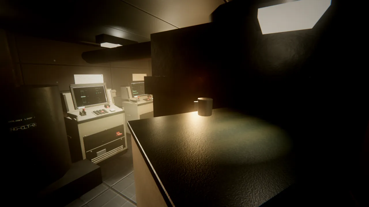
Engineering. The plant comes back derated, with a clamp on it and a wet deck still on the boat.
A failure costs the crew a person rather than a keypress. That is the whole reason for the rule.
What we would tell you before you try this
If you are considering a game with no HUD, the honest summary is this.
The design win is real and it arrives immediately: players talk to each other, because talking is the only channel that exists. We did not have to incentivise communication. We just had to remove the alternative.
The cost is that legibility becomes an art problem with no code smell. A broken HUD looks broken. An unreadable sign looks like a sign. Nothing in your tooling will tell you that the thing you built to be found in the dark is only visible in the light — you find that out from a person playing, and only if they can be bothered to mention it, and only if they realise it is a bug rather than them being bad at looking.
Budget for that. We did not, at first.
Next time: the horror director, and why we have spent more effort on what a normal dive sounds like than on what a bad one does.
- no-return-depth
- design
- technical-art